Photo: The Sartorialist
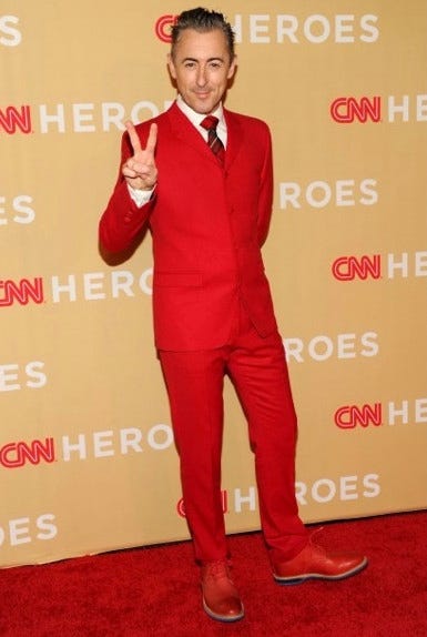
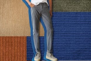
It’s color blocking day for #NoJeansJanuary! Before we get started, I’m sure some of you are wondering, what the hell is color blocking?
Well, it’s exactly what it sounds like. Color blocking is when an outfit is comprised of large blocks of solid color.
That means a solid camel coat, solid blue button up shirt and solid brown pants is a color blocked outfit. A brown leather jacket with a red plaid shirt and blue jeans is not, as the plaid shirt will be comprised of different colors in one item.
Before we get into blocking, let’s address wearing color in general, especially bright colors.
For most guys, colors like yellow tend to be reserved for Spring. Even then, they can be tricky and intimidating to incorporate into a wardrobe effortlessly.
Bright colors will pull your outfits out of what I like to call “Neutral Hell” and add new levels of interest and sophistication to your look, so long as you know when to pull the brakes.
I’ll show you how, without having to memorize any complicated color wheels.
WHAT GUYS GET WRONG ABOUT COLOR MATCHING
The number one question I get when I help guys wear more color always comes to down to matching.
“Should I match my pocket square to my tie?”
Effortless incorporation of color into an outfit is more about complementing than outright matching. The latter can lead to serious overkill and just looks like you’re trying way too hard.
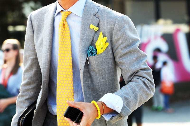
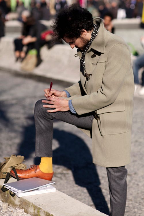
You’ve seen it before – the guy wearing a yellow tie, a yellow pocket square, yellow socks, yellow watch and yellow laces.
This is the clothing equivalent of salting a steak, covering it with a salty sauce and serving it with a side of salted roasted Brussel sprouts with bacon.
Total overkill.
THE TWO Cs OF WEARING COLOR:
CONTRAST AND COMPLEMENT
When it comes to adding color to your outfit, there are two ways to do it.
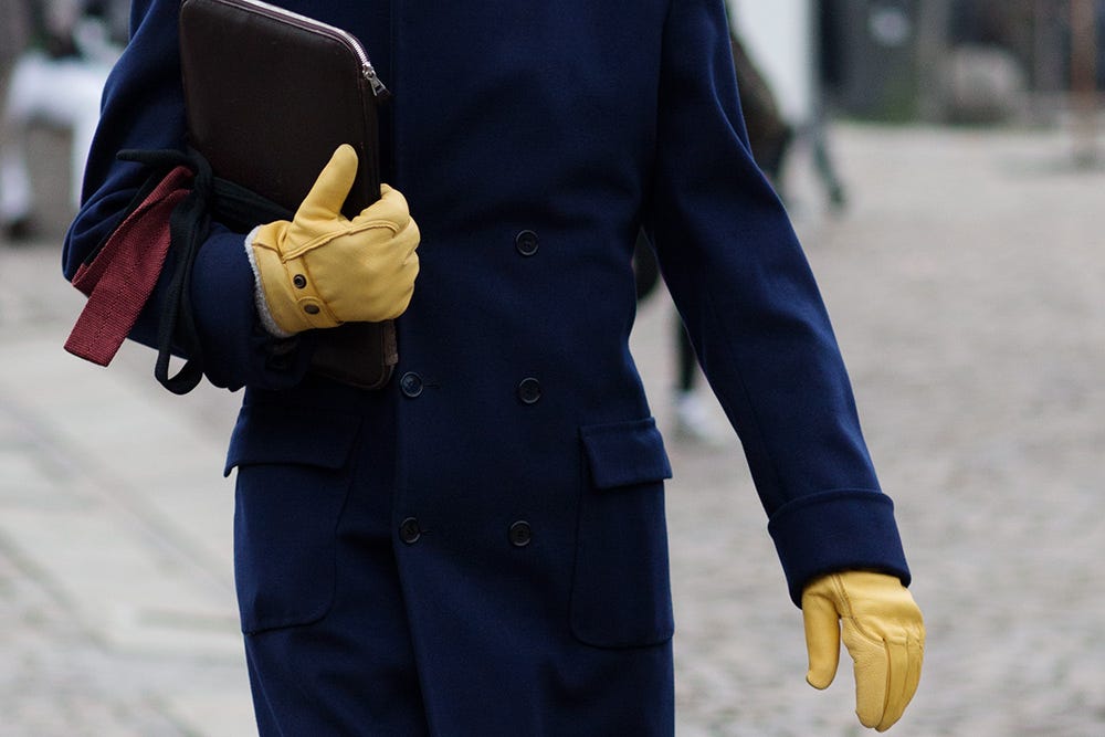
Photo: The Sartorialist
CONTRAST
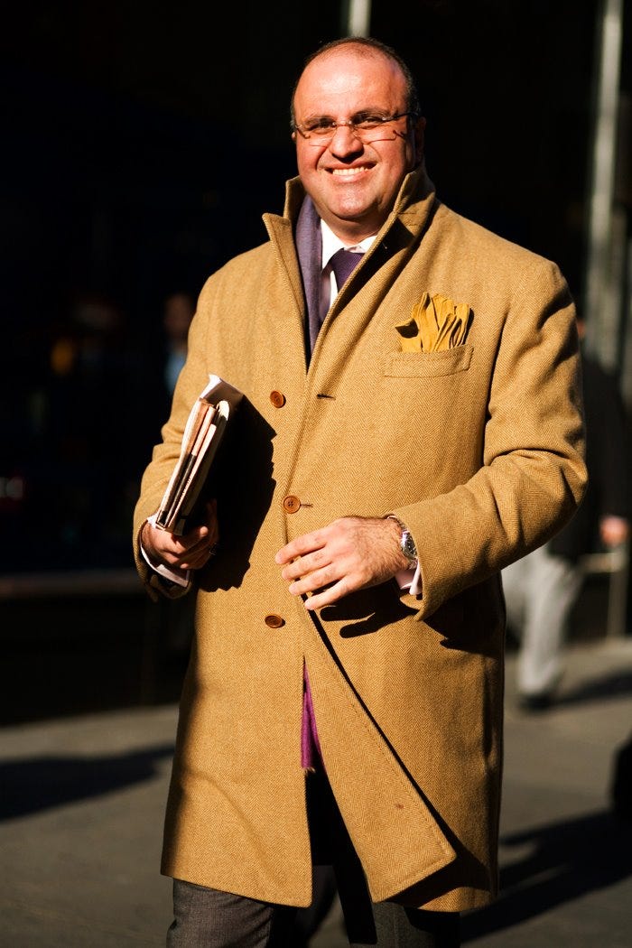
This is when you wear an item, say the yellow leather gloves of the gentleman in the photo above, stands out against the other colors of your outfit. It draws people’s eyes to the color and is a nice visual surprise. Contrast is all about surprise and attention.
When it comes to pop colors, there are some good rule of thumbs to follow:
- Less is more: The example above works because it’s one item in his outfit. If his laptop case and scarf were also the same yellow, it would be visual overkill. Stick to one pop per color.
- Start with a Neutral Base: Pop colors only work when they have something to pop against. Sticking to a neutral colors for the rest of your outfit (black, navy, grey, brown and now olives) will make the pop more effective.
{A beautiful example of yellow complements}
Photo: The Sartorialist
COMPLEMENT
Complement is when colors work seamlessly together, where one piece doesn’t overpower like in pop. Complementing is all about harmony and subtlety.
The trick to wearing yellow without making it a pop is reducing the contrast by tuning the intensities of your colors. This allows you to have more than one item in your outfit that’s yellow, so long as you make sure they’re not the same tone.
The man above does this beautifully. His coat is a subdued tone of yellow, leaning more towards a camel brown. The leather gloves peaking out of his breast pocket isn’t a lemon bright yellow, but also not the same tone as his coat. He softens the contrast even more by opting for a grayish purple tie, rather than a black.
This type of color in an outfit comes off as very sophisticated and pleasing, and not as difficult as you would think, so long as you stick to some rules:
- Soften Contrast by choosing less intense tones of color, like a mustard yellow.
- Lighter Neutrals like navy, grey, browns and olive futher help soften the contrast of yellow compared to, say, black.
- Mix Tones of The Color Unlike pop, you can easily wear more than one item of a tricky color so long as you mix different tones of it, like the example of the Gentleman above with his coat and gloves. Choosing neutrals with hints of the tricky color – like a yellowish brown camel, compliments without outright matching. Resist trying to add the color to each piece in your outfit, like yellow shoelaces, yellow pocket square and a yellow belt. Less is still more.
{Too many of the same pop color competing with each other}
Photo: Streetfsn
THE “SQUINT” TECHNIQUE
One of my favorite tricks I use is something I’ve dubbed “The Squint”, which is exactly what it sounds like.
By squinting, you blur out the details and distractions so you can focus on colors. With it, you can roughly gauge how well your colors are working together depending on your goal.
If you’re going for a pop and too many different elements of the same color are competing for attention, it’ll let you know you to take out a few elements.
If you’re going for compliments and find a piece is popping out too much, it’ll let you know you should tone it down.
Photo: Mimosasandme
PUTTING IT ALL TOGETHER
- Start Small Add one element for some pop – a yellow pocket square, scarf or tie. Start with a solid neutral outfit to play up the contrast.
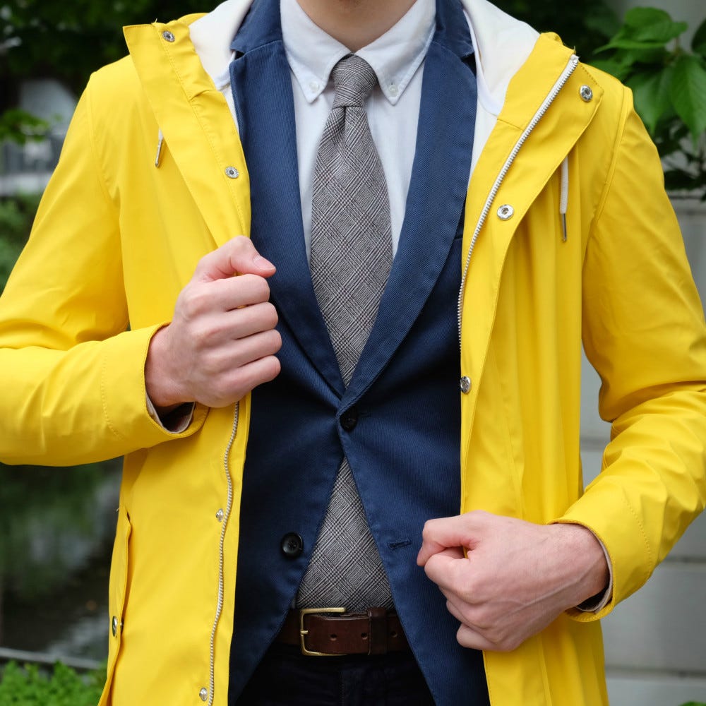
- Graduate to a Larger Piece A classic yellow raincoat over your suit is an easy addition, like with the look above.
- Soften Contrast Add more pieces of yellow into your outfit in different tones to reduce the contrast and give your look a sophisticated level of color combinations. An easy way? Find neutrals with hints of yellow, like warmer grays and lighter browns. Avoid visual black holes like black and dark navy.
- Mix Contrast and Compliments As you get more comfortable wearing varying tones of color in your outfit, you can get advanced by mixing the two. Add a pop in a different color. Just remember the rules: start small, less is more.
THREE COLOR BLOCKING LOOKS
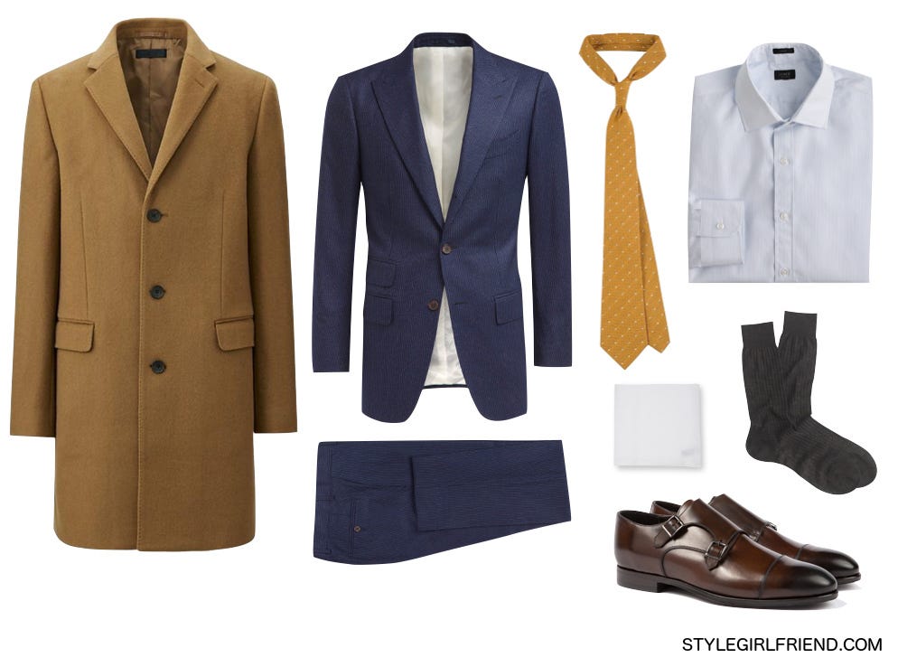
Work
Coat: Uniqlo, $149 | Suit: Suit Supply, $499 | Tie: Suit Supply, $45 | Shirt: J.Crew, $88 Socks: Pantherella, $27 | Pocket Square: Simonnot Godard, $65
Shoes: Suit Supply, $299
Wear it well: For those that are bound by the suit at the workplace, the pop color tie is a great way of sticking to business formality while making your look a lot more interesting. Tone down the intensity and go for a mustard yellow, which pops just the right amount. A black suit is too stark of a contrast with a yellow tie, so opt for navy instead. Resist the urge to match your pocket square or socks with your tie and stick to a classic white square and dark socks. The cashmere overcoat in camel, a yellowy shade of brown, softens the contrast even more and matches the yellow just the right amount.
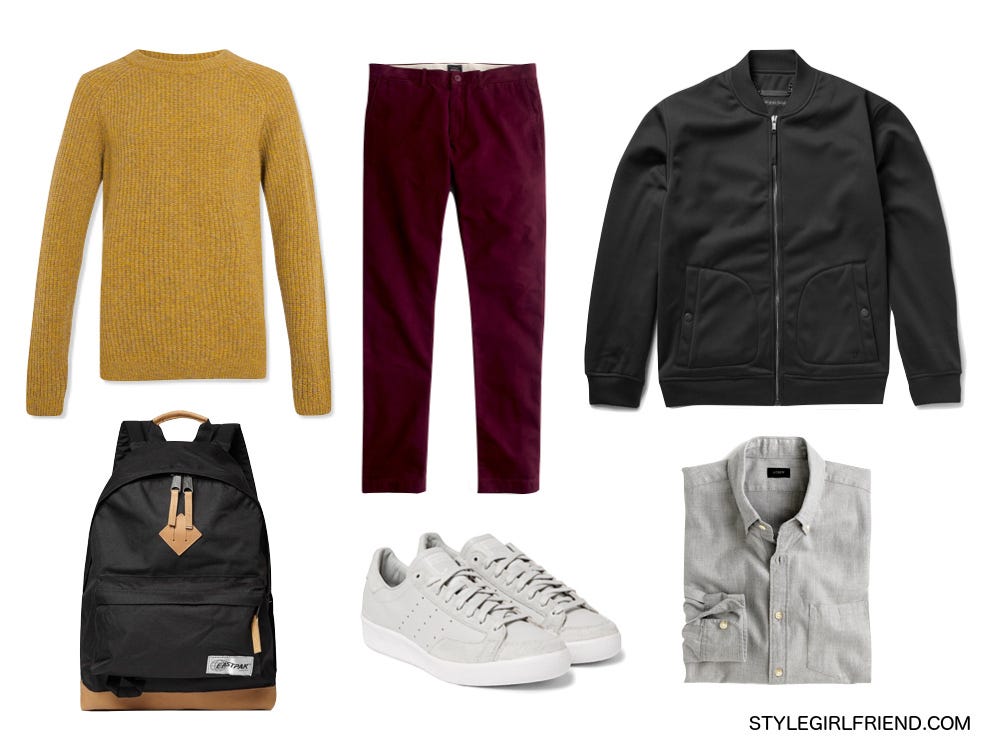
School
Sweater: Topman, $80 | Pants: J.Crew, $75 | Bomber: Marc by Marc Jacobs, $300
Bag: Eastpak, $95 | Shoes: Adidas x White Mountaineering, $140
Shirt: J.Crew, $79
Wear it well: You’re better than pajama pants and a college hoodie when it comes to the classroom. The yellow knit sweater is a bold choice, and throwing a strong black bomber over it plays up the pop. The Style Girlfriend approved wine colored chinos plays off the warm tones off the sweater. Opting for a grey suede sneaker keeps it light without giving your look another pop like a white sneaker would. The black backpack is a classic that keeps the color palette tight, while the natural leather details on the bag subtly call out the yellow in the sweater.
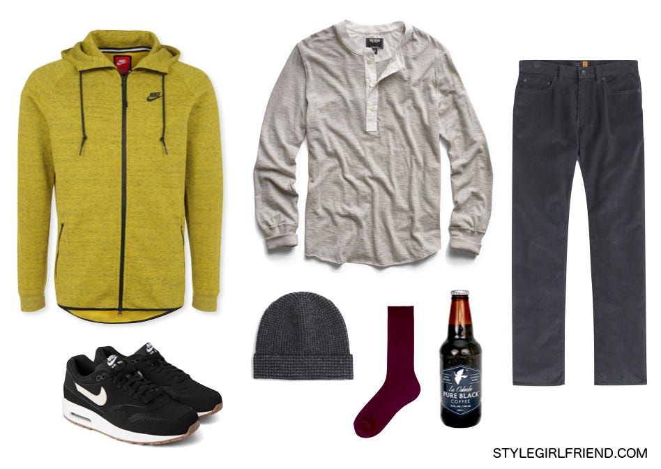
Weekend
Zip-up: Nike, $104 | Henley: Todd Snyder, $125 | Pants: J.Crew, $75
Sneakers: Nike, $110 | Beanie: J.Crew, $35 | Socks: Uniqlo, 4 for $12
Coffee: La Colombe, 2 for $8
Wear it well: Weekend unwinding starts off with strong coffee and a more casual look. If you’re a freak like me who still enjoys iced coffee long past Summer, La Colombe’s bottled Pure Black is a perfect solution. Activewear is always a great source for bright colors all year round, and begs to be paired with sneakers. A solid, neutral base makes the zip-up pop nicely, but add a little color to your socks to break up the “Neutral Hell.” Wine colored socks are a perfect sophisticated choice.
TELL ME:
HOW DO YOU COLOR BLOCK?
Peter Nguyen is a Private, Personal Stylist for Successful Entrepreneurs in New York City. He previous worked as the Design Assistant to Robert Geller. You can read more of his writing on personal style over at The Essential Man.
Want more? He’s set up a special page for Style Girlfriend readers with two free bonuses: A beautiful, high-res PDF version of this post, and a new 7-page guide, “How to Wear Even More Colors This Fall”, where he gives you tips along with outfit examples for adding blue, purple, orange and red to your looks.
